1.3 Using Maps
Maps
Earth is almost a perfect sphere, which makes accurately representing it on a paper or computer screen difficult. Earth is three-dimensional while a piece of paper has two dimensions. Thus, all maps have distortions inherent in them.
A first step in representing Earth on a map is to establish a coordinate system. This coordinate system uses longitude and latitude lines.
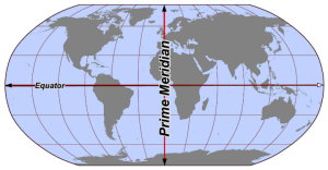
Longitude lines (also called meridians) go from the North Pole across the equator to the South Pole.
By convention, a Prime Meridian was established as 0o. The Prime Meridian is situated in Greenwich, England. Traveling east or west of the Prime Meridian provides a degrees east or west longitude location.
Latitude lines (also called parallels) are oriented east and west with zero latitude being the equator.
Latitude lines north of the equator increase up to 90oN at the North Pole. Likewise, latitude lines south of the equator are designated with an “S”.
The latitude-longitude coordinates provide a grid to create maps and place features on these maps. Since all maps have some distortion, many different map projections have been developed.
Each map projection has advantages and disadvantages. Several types of maps used in this course are Mercator, Robinson, and Mollweide.
To reduce distortions and keep the accuracy as high as possible, many different map projections have been developed. Each map projection has advantages and disadvantages.
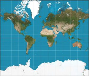
The Mercator map projection was originally developed for nautical navigation and places a route at a constant angle to the lines. Representation of features near the equator is good, while accurate representation near the poles is poor. Notice how Greenland is extremely large.
Mercator projection
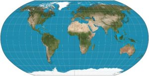
To reduce the distortion near the poles, a Robinson projection was developed. This projection curves the longitude lines near the poles inward. The actual size of Greenland is better represented.
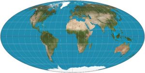
Following this approach further, the Mollweide projection was developed. This projection curves the longitude lines all the way into the pole. Greenland is much better represented.
Topographical Maps
With the essentials about maps covered, data is ready to be placed on them. One type of data widely used on maps is elevation data. Maps with elevation data are called topographical maps. Understanding topographic maps lends itself to the process of interpreting weather maps. Thus, taking a quick look at topographical maps is useful.
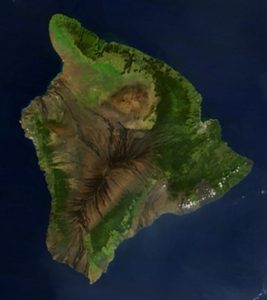
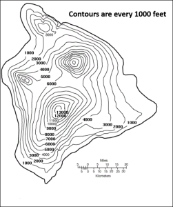
A topographical map of the Big Island in Hawaii is a good illustration. Since the Big Island is surrounded by water, the elevation at the coast is sea-level or zero. There are two high volcanic summits of Mauna Loa and Mauna Kea at 13,452 feet and 13,796 feet. Hence, the change in elevation on the Big Island is dramatic.
A topographical map of Hawaii (right) gives a representation of elevation. The more contour lines, the greater the change in elevation. Note the two volcanic peaks on the contour map and compare them with the image of Hawaii taken from space (left).
Each contour on the map is an isopleth, which is a contour connecting points of equal value (“iso” translates to “equal” and “pleth” means “value”). In this case, the isopleths connect points of equal elevation above sea level and are drawn for every 1,000 feet of elevation above sea level. Isopleths can be drawn at any interval. The lower the interval between isopleths the higher the resolution of the map.
