5.3 Modeling Linear Relationships with Regression

5.3: Modeling Linear Relationships with Regression
Learning Objectives
Upon completion of this section, you should be able to
- Construct a scatter plot
- Calculate the correlation coefficient to describe the linear relationship between two quantitative variables
- Create a linear regression model between two quantitative variables using a spreadsheet
- Interpret a linear regression model in applications
Scatter Plots
When we have bivariate data (data with two quantitative variables) that has a linear relationship it is rare for all the data points to fit directly on a straight line. If it did fit a straight line we could just use a little algebra to find an equation of a line that goes through all the points (as we did earlier). Since this typically does not happen, we have to find another way to model the data with a linear equation. One method that you may have used in the past is picking two points whose line best fits the data. Since two people can come up with different solutions for the same data set by picking different points a better method is needed. The method we are going to look at fits the data by trying to minimize the distance of all points for the line. This is called a Line of Best Fit, Least Squares Regression Line, or Trendline.
Warning: Always check first that the relationship between the two variables look linear before finding the regression line. If it doesn't look linear you may want to use a different type of equation to model the data. Most spreadsheet programs, graphing calculators, and statistical software packages will have a variety of function to choose from for the model to use. We will start this section off with constructing Scatter Plots to inspect visually the relationship between two quantitative variables.
When you look at a scatterplot, you want to notice the overall pattern and any deviations from the pattern. In this section, we will focus on scatterplots that show a linear pattern, which we’ll model with a line. We can then use the equation of the model line to predict the response variable values for given values of the explanatory variable.
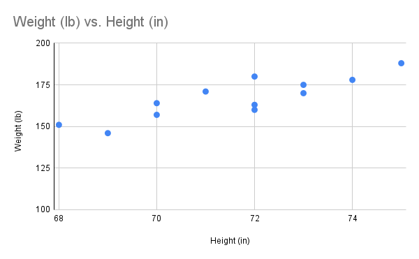
Before we take up the discussion of linear regression and correlation, we need to examine a way to display the relation between two quantitative variables and . By way of illustration, let's consider something with which we may be familiar with: height and weight. If we were to randomly select several 25-year-old men and measure the height and weight of each one, we might obtain a collection of pairs something like this:
| Height (in) | 68 | 69 | 70 | 70 | 71 | 72 | 72 | 72 | 73 | 73 | 74 | 75 |
|---|---|---|---|---|---|---|---|---|---|---|---|---|
| Weight (lb) | 151 | 146 | 157 | 164 | 171 | 160 | 163 | 180 | 170 | 175 | 178 | 188 |
A plot of these data is shown below "Plot of Height and Weight Pairs". Such a plot is called a scatter diagram or scatter plot.
Looking at the plot it is evident that there exists a linear relationship between height and weight , but not a perfect one. The points appear to be following a line, but not exactly. There is an element of randomness present. We also observe that as the height increases so does the weight. We say this is a positive correlation between the two variables.
Click to reveal more information
The image is a scatter plot graph illustrating the relationship between weight in pounds (lb) and height in inches (in). The x-axis represents height, ranging from 68 to 76 inches, while the y-axis represents weight, ranging from 100 to 200 pounds. Blue dots are scattered across the graph to indicate data points. The distribution shows a general upward trend where weight increases with height. The dots are moderately spread, suggesting some variation in weight for similar heights.
Scatter Plot
A scatter plot is a graph that displays the relationship between two variables (connected to each other) using dots on a grid. Each dot represents a pair of data points, with one value determining its horizontal position (-axis) and the other its vertical position (-axis).
To create a scatter plot:
- Choose which variable goes on each axis. The independent variable (the one you think might influence the other) usually goes on the -axis.
- Draw a dot for each pair of data points at their corresponding and positions.
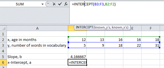
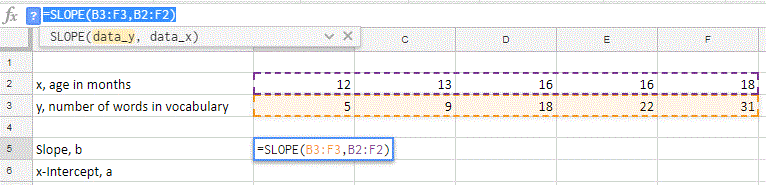
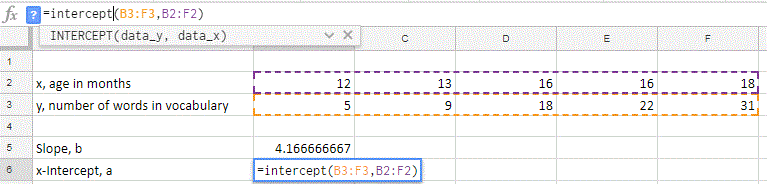
Example 1
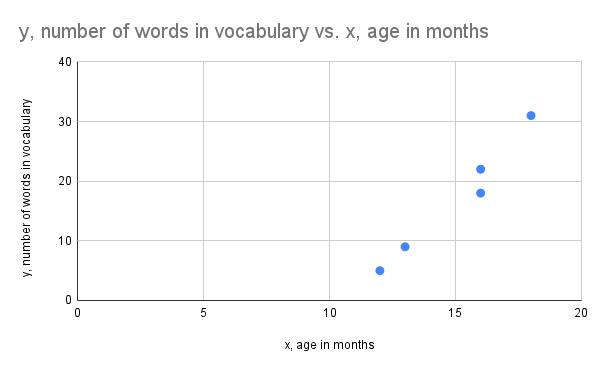
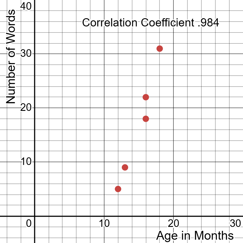
Construct a scatter plot for the data given in the table below where the age in months and the number of words in the vocabulary is measured for 5 children.
| , age in months | 12 | 13 | 16 | 16 | 18 |
|---|---|---|---|---|---|
| , number of words in vocabulary | 5 | 9 | 18 | 22 | 31 |
Solution
Each column would represent an ordered pair for the data set. We would expect the age of the child to explain the output for the number of words, so using age to represent the variable on the -axis values makes sense and is appropriate as it is the independent (explanatory) variable.
From the table we create a list of data points to graph: .
When constructing the scatter plot it is important to include labels on the x and y axis to indicate what the values represent. You also want to make sure the scale is consistent on each axis (equal distance between two values represents the same distance in each case on the number line). On the graph below we can see a close linear relationship between the age of the child and the number of words in the vocabulary with a positive slope.
Click to reveal more information
The image is a scatter plot graph displaying the relationship between age in months (x-axis) and the number of words in vocabulary (y-axis). The x-axis ranges from 0 to 20 months, and the y-axis ranges from 0 to 40 words. There are five blue data points plotted on the graph, showing an upward trend as age increases. The data points indicate that as the age in months increases, the number of words in vocabulary tends to increase as well.
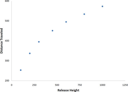
Not all scatter plots show linear relationships. The scatterplot below shows the results of an experiment conducted by Galileo on projectile motion. In the experiment, Galileo rolled balls down an incline and measured how far they traveled as a function of the release height. It is clear from scatterplot that the relationship between "Release Height" and "Distance Traveled" is not described well by a straight line: If you drew a line connecting the lowest point and the highest point, all of the remaining points would be above the line. The data are better fit by a parabola.
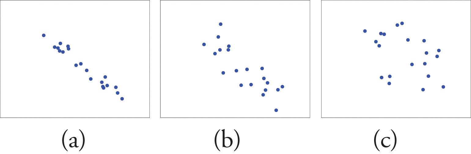
Scatter plots that show linear relationships between variables can differ in several ways including the slope of the line about which they cluster and how tightly the points cluster about the line. A statistical measure of the strength of the relationship between two quantitative variables that takes these factors into account is the subject of the section "Correlation Coefficient."
Correlation Coefficient
The official name for the correlation coefficient is a bit of a mouthful "Pearson product-moment correlation coefficient" and was developed by Karl Pearson in the 1900s. The correlation coefficient is a measure of the strength of the linear relationship between two variables. It is referred to as Pearson's correlation or simply as the correlation coefficient. If the relationship between the variables is not linear, then the correlation coefficient does not adequately represent the strength of the relationship between the variables. It is always important to check the actual scatter plot to see if it is appropriate to calculate the correlation coefficient.
The symbol for Pearson's correlation is the greek letter "rho" or "ρ" when it is measured in the population and "r" when it is measured in a sample. Because we will be dealing almost exclusively with samples, we will use to represent Pearson's correlation unless otherwise noted.
Pearson's can range from -1 to 1. An of -1 indicates a perfect negative linear relationship between variables, an of 0 indicates no linear relationship between variables, and an of 1 indicates a perfect positive linear relationship between variables.
The scatterplots below "Linear Relationships of Varying Strengths" illustrates linear relationships between two variables and of varying strengths. It is visually apparent that in the situation in panel (a), could serve as a useful predictor of , it would be less useful in the situation illustrated in panel (b), and in the situation of panel (c) the linear relationship is so weak as to be practically nonexistent. The correlation coefficient is a number computed directly from the data that measures the strength of the linear relationship between the two variables and .
Try the Guess the Correlation game from geogebra or if you have Java enabled on your browser you can practice guessing correlation coefficient values with this simulator at: http://onlinestatbook.com/2/describing_bivariate_data/pearson_demo.html
Calculating the correlation coefficient by hand can be challenging when just looking at the formula. Thankfully most spreadsheet programs and calculators will do this for you. The definition below will show the formula, but in general software is used to do the calculations over doing the work by hand as we are often using data sets with hundreds or thousands of values.
Correlation Coefficient, r
The correlation coefficient for data based on a sample from a population is found by,
where = the number of paired data points.
Remember the greek letter sigma, "Σ", means to sum up the values. We did similar calculations when finding the mean and standard deviation.
In the next example we will revisit the age of a child in months and the child's vocabulary to find the correlation coefficient. The formula will be used, but information on how to use a spreadsheet to do this calculation is also provided. Using a spreadsheet program will significantly decrease the time that is needed to do these computations and is recommended.
Example 2
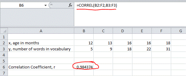
Find the correlation coefficient for the data given in the table below where the age in months and the number of words in the vocabulary is measured for 5 children.
| , age in months | 12 | 13 | 16 | 16 | 18 |
|---|---|---|---|---|---|
| , number of words in vocabulary | 5 | 9 | 18 | 22 | 31 |
Solution
To start we are going to rearrange the table and add in columns that are needed in the formula. We need to sum up all the values of each variable, the squared values, and the products. The table below shows the appropriate columns added and on the bottom row the sum of that column was found.
| x | y | x2 | y2 | xy | |
|---|---|---|---|---|---|
| 12 | 5 | 144 | 25 | 60 | |
| 13 | 9 | 169 | 81 | 117 | |
| 16 | 18 | 256 | 324 | 288 | |
| 16 | 22 | 256 | 484 | 352 | |
| 18 | 31 | 324 | 961 | 558 | |
| SUM | 75 | 85 | 1149 | 1875 | 1375 |
Now that we have the values we will put each output in that sum row into the appropriate location in the formula for the correlation coefficient, . Keep in mind that represent the number of paired values, so
Visually we can see the scatterplot below:
Click to reveal more information
The image is a scatter plot with a grid background showing a positive correlation between two variables: "Age in Months" on the x-axis and "Number of Words" on the y-axis. Both axes are marked with increments of 10 units. Five red data points ascend diagonally from the lower left (around 11 months and 6 words) to the upper right (around 18 months and 31 words), indicating an upward trend. The plot is labeled with the text "Correlation Coefficient 0.984" at the top.
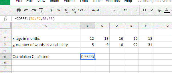
Now if we decided to use a spread sheet program like Google Sheets or Excel we can use a function called "Correl" inside and have the correlation coefficient computed for the data. A view of each with the table and the function used is given below.
Excel: Enter the data into either rows or columns. In the image below we see the table as originally presented with values of the same variable in rows. To find the value of r we enter into another cell on the spread sheet "CORREL(Arrayx,Arrayy)" Where the Arrayx is the cell locations for just the data values of age and Arrayy is the cell location for the data values of number of words (vocabulary). The output is seen to match the value we computed above, .
Google Sheets: The instructions are exactly the same for Google Sheets.
Now that we have seen how to calculate the correlation coefficient, , we will look at the properties to better understand what a given value of represents.
Properties of Correlation Coefficient, r
- The value of lies between -1, and 1, inclusive.
- The sign of indicates the direction of the linear relationship between and :
- If then tends to decrease as is increased. We call that a negative correlation.
- If then tends to increase as is increased. We call that a positive correlation.
- A scatter plot showing data with a positive correlation.
- A scatter plot showing data with a negative correlation.
- A scatter plot showing data with zero correlation.
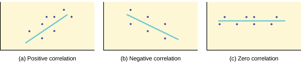
- The size of indicated the strength of the linear relationship between and :
- If is near 1 (that is, if is near either 1 or -1) then the linear relationship between and is strong.
- If is near 0 (that is, if is near 0 and of either sign) then the linear relationship between and is weak.
Below are six different scatter plots to show the behavior of the correlation coefficient with different spread of data. Take note of both the sign of and the size of for how the distribution of points change the value of .
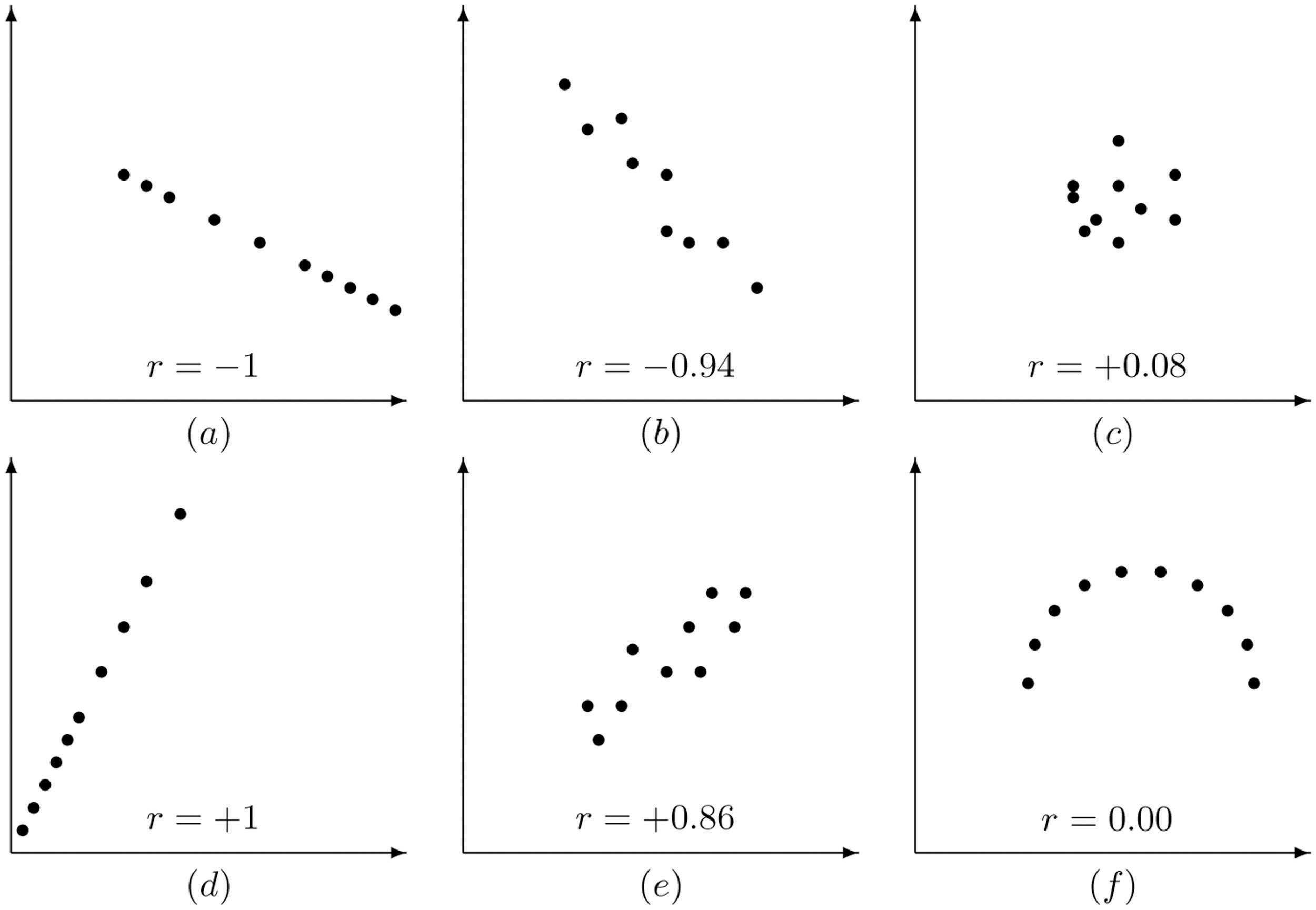
- Scatter plot with showing a perfect linear association with negative slope.
- Scatter plot with showing a close linear association with negative slope.
- Scatter plot with showing a relationship that has almost no linear relationship.
- Scatter plot with showing a perfect linear association with positive slope.
- Scatter plot with showing a close linear association with a positive slope.
- Scatter plot that has a perfect relationship that is not linear with .
Try it Now 1
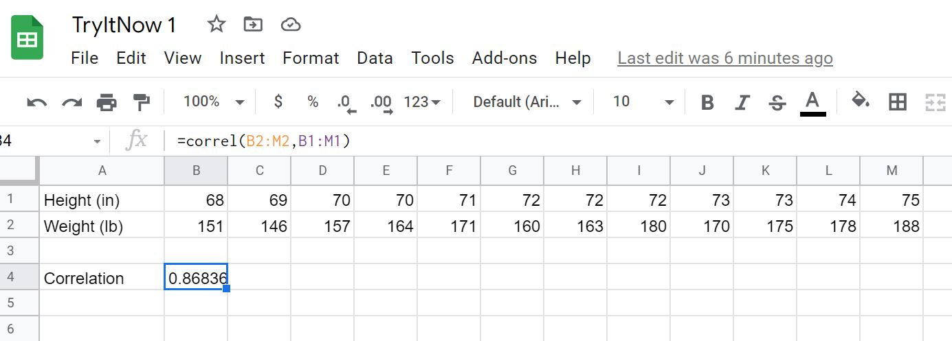
Calculate the correlation coefficient for the sample of 25 year old mens height and weight given in the table below.
| Height (in) | 68 | 69 | 70 | 70 | 71 | 72 | 72 | 72 | 73 | 73 | 74 | 75 |
|---|---|---|---|---|---|---|---|---|---|---|---|---|
| Weight (lb) | 151 | 146 | 157 | 164 | 171 | 160 | 163 | 180 | 170 | 175 | 178 | 188 |
Hint 1 (click to Show/Hide)
If calculating with the formula start with the table that includes squared values and products of the two values. If calculating with technology start with copying and pasting the table into Google Sheets or Excel, then use the correl function to find the correlation coefficient.
Answer (click to Show/Hide)
Calculating the correlation using the formula start with the table
| 68 | 151 | 4624 | 22801 | 10268 | |
| 69 | 146 | 4761 | 21316 | 10074 | |
| 70 | 157 | 4900 | 24649 | 10990 | |
| 70 | 164 | 4900 | 26896 | 11480 | |
| 71 | 171 | 5041 | 29241 | 12141 | |
| 72 | 160 | 5184 | 25600 | 11520 | |
| 72 | 163 | 5184 | 26569 | 11736 | |
| 72 | 180 | 5184 | 32400 | 12960 | |
| 73 | 170 | 5329 | 28900 | 12410 | |
| 73 | 175 | 5329 | 30625 | 12775 | |
| 74 | 178 | 5476 | 31684 | 13172 | |
| 75 | 188 | 5625 | 35344 | 14100 | |
| SUM | 859 | 2003 | 61537 | 336025 | 143626 |
We found the correlation coefficient to be approximately 0.868.
By Google Sheets:
Copy the table into Google Sheets and use the function correl. We have a correlation coefficient of approximately 0.868 as we did by hand. See screenshot below. Google Sheets for Try it Now1
Least Squares Regression Line
Once a scatterplot of the data has been drawn and we visually verify a linear model is a good fit (and perhaps the correlation coefficient computed to quantitatively verify the linear trend), the next step in the analysis is to find the straight line that best fits the data.
Least Squares Regression Line
Given a collection of pairs , there is a line that best fits the data in the sense of minimizing the sum of the squared distances (errors) from a point to the regression line. The slope, , and -intercept , are computed using the formulas below:
Note: You must find "" first in order to find "" if you are calculating this by hand.
In some statistics books you may see the form of the line written as , where would represent the slope and is the -intercept.
The is read " hat" and is the estimated value of . It is the value of obtained using the regression line. It is not generally equal to from data. The interesting fact is that there is only one solution for the regression line that minimizes those squared distances (unless you have all the -values being exactly the same).
Calculating the trend line by hand is not typically done. In the first example below we are going to revisit the data of five children where we compared the age in months to the number of words in the childs vocabulary. The work for the trend line based on the formula is shown, but below that the steps for adding a trend line are given.
Example 3
Construct the least squares regression line for the data given in the table below where the age in months and the number of words in the vocabulary is measured for 5 children.
| , age in months | 12 | 13 | 16 | 16 | 18 |
|---|---|---|---|---|---|
| , number of words in vocabulary | 5 | 9 | 18 | 22 | 31 |
Solution
In our work from above we already found the correlation coefficient,, to be approximately 0.984. Find the sample mean and standard deviation for each variable (this can be done from the formulas or by using technology - the formula method is shown below).
Now use the formula and find the slope and intercept for the regression line.
The scatter plot and regression line is shown below.
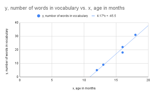
Click to reveal more information
The image is a scatter plot graph representing the relationship between age in months (x-axis) and the number of words in vocabulary (y-axis). The x-axis ranges from 0 to 20, while the y-axis ranges from 0 to 40. There are five blue data points scattered across the graph, showing an upward trend. A trend line is drawn in blue, passing through the points, with the equation 4.17*x + -45.5. The graph title, "y, number of words in vocabulary vs. x, age in months," is at the top. A legend indicates that the blue dots represent "y, number of words in vocabulary" and the blue line represents the trend line equation.
To find the linear regression line using Excel or Google Sheets we can use the following two functions that give the slope for the regression line and the -intercept: SLOPE, INTERCEPT. For both function we enter the array of values for the data, but we put in the -variable values in first as instructed in the function when called in the program.
Excel:
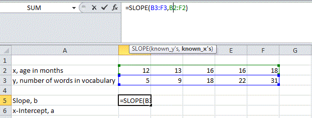
Google Sheets:
Finding a linear regression line can be done with software very easily, so the focus from this point is on when it should be found and how to use it (interpret the values).
Understanding the Linear Regression Line
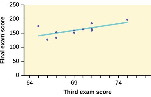
To better understand the linear regression line let us look at another example. A random sample of 11 statistics students produced the following data, where is the third exam score out of 80, and is the final exam score out of 200. Can you predict the final exam score of a random student if you know the third exam score? The table below is the results from the 11 students.
| x (third exam score) | 65 | 67 | 71 | 71 | 66 | 75 | 67 | 70 | 71 | 69 | 69 |
|---|---|---|---|---|---|---|---|---|---|---|---|
| y (final exam score) | 175 | 133 | 185 | 163 | 126 | 198 | 153 | 163 | 159 | 151 | 159 |
The third exam score, , is the independent variable and the final exam score,, is the dependent variable. Before we jump in to find the regression line it is best to plot the data to confirm a linear relationship looks visible.
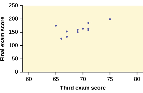
In the graph we can see that the data falls close to a straight line with a positive slope. The least squares regression line for the third-exam/final-exam example has the equation:
The slope of the line, , describes how changes in the variables are related. It is important to interpret the slope of the line in the context of the situation represented by the data. You should be able to write a sentence interpreting the slope in plain English.
Interpretation of the slope
The slope of the regression line tells us how the dependent variable () changes for every one unit increase in the independent () variable, on average.
THIRD EXAM vs FINAL EXAM EXAMPLE
The slope of the line is .
Interpretation: For a one-point increase in the score on the third exam, the final exam score increases by 4.83 points, on average.
Notice that in the interpretation we refer to the value of the slope (4.83) to be the change in the dependent variable for a one unit change of the independent variable (third exam scores). Visually we think of the slope as how far in the -direction the line moves for a one unit increase in value of the variable.
What about the -intercept?
Interpretation of -intercept
The -intercept would represent the predicated value when . This sometimes means it is a starting amount, but in other times the value may make no sense in terms of the application.
THIRD EXAM vs FINAL EXAM EXAMPLE
The -intercept of the line is .
Interpretation: In this case the -intercept does not have any meaning as it is impossible to have an exam score that is below 0. What happened here is that we are trying to interpret something outside of a reasonable region of interest based on the data collected and we ended up with a value that just doesn't make sense in the application.
We should only use the regression line to predict values within the range of the given data set. For instance in our example with children's vocabulary and age it is okay to use the linear regression line to predict the vocabulary of a child at age 15 months as 15 months between the lowest and highest recorded age, but using that regression line to predict the vocabulary at age 24 months is not appropriate as we don't know if that linear relationship continues as the child gets older. It most likely will not as the childs language skills tend to develop faster as they get older (until a certain point). Trying to use the linear regression line outside of the data range it was constructed from is called extrapolation.
Interpolation and Extrapolation
The process of using the least squares regression equation to estimate the value of at a value of that lies within the range of the -values in the data set that was used to form the regression line is called interpolation.
The process of using the least squares regression equation to estimate the value of at a value of that does not lie in the range of the -values in the data set that was used to form the regression line is called extrapolation. It is an invalid use of the regression equation that can lead to errors, hence should be avoided.
Going back to our third exam/final exam example suppose we want to estimate, or predict, the mean final exam score of statistics students who received 73 on the third exam. The exam scores (-values) range from 65 to 75. Since 73 is between the -values 65 and 75, substitute into the equation. Then:
We predict that statistics students who earn a grade of 73 on the third exam will earn a grade of 179.08 on the final exam, on average.
If we wanted to use the linear regression line to predict the final exam score for a student who scored a 90 on the third exam we will get an unexpected result as we are now trying to use the model outside of the given range for the data set (our third exam scores were between 65 and 75 for the regression line). Make the substitution into the equation and see what happens:
The final-exam score is predicted to be 261.19. The largest the final-exam score can be is 200.
Try it Now 2
Data was collected on the relationship between the number of hours per week practicing a musical instrument and scores on a math test. The data had values ranging from 2 hours to 14 hours of musical practice time per week. The linear regression line is as follows:
What would you predict the score on a math test would be for a student who practices a musical instrument for five hours a week?
Hint 1 (click to Show/Hide)
Before using the linear regression line verify that we are not extrapolating outside of the given data region. We are trying to predict the score on the math test for the given number of hours being five. Since five hours is within the given set of hours of practice used in the data set it is safe to use the linear regression line.
Evaluate the linear regression line by substitution in into the equation ( being the number of hours practiced).
Answer (click to Show/Hide)
Evaluate at since the value falls within the given data set range used to construct the linear regression line.
If a student practices five hours during the week on the musical instrument it is predicted that the final exam score would be 86.5.
Exercises
- For a certain class, the relationship between the amount of time spent studying and the test grade earned was examined. It was determined that as the amount of time they studied increased, so did their grades. Is this a positive or negative association?
Answer (click to Show/Hide)
This is a positive association (positive correlation).
- For this same class, the relationship between the amount of time spent studying and the amount of time spent socializing per week was also examined. It was determined that the more hours they spent studying, the fewer hours they spent socializing. Is this a positive or negative association?
Answer (click to Show/Hide)
This is a negative association (negative correlation).
- In each case state whether you expect the two variables and indicated to have positive, negative, or zero correlation.
- the number of pages in a book and the age of an adult author
- the number of pages in a book and the age of the intended reader
- the weight of an automobile and the fuel economy in miles per gallon
- the weight of an automobile and the reading on its odometer
- the amount of a sedative a person took an hour ago and the time it takes them to respond to a stimulus
Answer (click to Show/Hide)
- We would expect zero correlation.
- We would expect a positive correlation (as this would include younger readers as well).
- We would expect a negative correlation.
- We would expect zero correlation.
- We would expect a negative correlation.
- In each case state whether you expect the two variables x and y indicated to have positive, negative, or zero correlation.
- the temparature outside and the number of eegees (cold frozen typically fruity drink) sold per day.
- the average length of time that calls to a retail call center are on hold one day and the number of calls received that day
- the length of a regularly scheduled commercial flight between two cities and the headwind encountered by the aircraft
- the value of a house and the its size in square feet
- the average temperature on a winter day and the energy consumption of the furnace to heat a house.
Answer (click to Show/Hide)
- We would expect a positive correlation.
- We would expect a positive correlation.
- We would expect zero correlation.
- We would expect a positive correlation.
- We would expect a negative correlation.
- True/False: The correlation in real life between height and weight is .
Answer (click to Show/Hide)
False
- True/False: It is possible for variables to have but still have a strong association.
Answer (click to Show/Hide)
True
- True/False: Two variables with a correlation of 0.3 have a stronger linear relationship than two variables with a correlation of -0.7.
Answer (click to Show/Hide)
False
- True/False: A correlation of is not possible.
Answer (click to Show/Hide)
True - For the sample data
1 3 5 7 9 9 6 6 4 2 - Draw the scatter plot
- Find the correlation coefficient (round answer to two decimal places)
- Find the linear regression line.
Answer (click to Show/Hide)
- Scatter plot below includes linear regression line.
Scatterplot vs and linear regression line" Google Sheet for Exercise 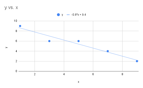
Click to reveal more information
The image is a scatter plot graph with a linear regression line, showing the relationship between variables x and y. The x-axis is labeled from 0 to 10, and the y-axis is marked from 0 to 10. There are five blue data points scattered across the graph, roughly forming a downward trend from the top left to the bottom right of the chart. A light blue linear regression line with the equation "-0.8*x + 9.4" extends through the points. The graph is titled "y vs. x" and has horizontal and vertical grid lines for reference.
- Correlation coefficient is
- The equation for the linear regression line is
- For the sample data
1 4 4 5 10 11 13 18 2 5 4 7 15 12 16 15 - Draw the scatter plot
- Find the correlation coefficient (round results to four decimal places)
- Find the linear regression line. (round results to four decimal places)
Answer (click to Show/Hide)
- Scatter plot below includes linear regression line.
Scatterplot vs and linear regression line" Google Sheet for Exercise 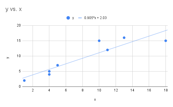
Click to reveal more information
The image is a scatter plot displaying data points and a trend line on a Cartesian coordinate system. The x-axis is labeled "x" with values ranging from 0 to 18, while the y-axis is labeled "y" with values from 0 to 20. Several blue data points are plotted across the graph. A light blue trend line represents the linear equation "y = 0.905*x + 2.03" which is displayed in the legend. The legend on the top indicates these elements with a blue dot representing "y" and the equation.
- Correlation coefficient is
- The equation for the linear regression line is
- For the sample data
4 5 6 7 8 9 12 15 18 21 - Draw the scatter plot
- Find the correlation coefficient
- Find the linear regression line.
Answer (click to Show/Hide)
- Scatter plot below includes linear regression line.
Scatterplot vs and linear regression line" Google Sheet for Exercise 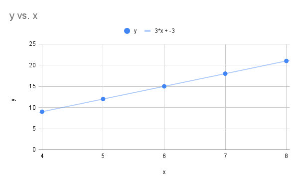
Click to reveal more information
The image is a line graph titled "y vs. x," displaying a linear relationship between the variables y and x. The x-axis ranges from 4 to 8, while the y-axis spans from 0 to 25. A series of blue data points are plotted along the line, starting at approximately (4, 9) and ending at (8, 21). A light blue line connects these points, following the equation y = 3x - 3. The graph includes grid lines for easier reading of values and a legend at the top center indicating the data point and line equation in matching blue color.
- Correlation coefficient is
- The equation for the linear regression line is
- For the sample data
1 3 5 7 9 26 24 22 20 18 - Draw the scatter plot
- Find the correlation coefficient
- Find the linear regression line.
Answer (click to Show/Hide)
- Scatter plot below includes linear regression line.
Scatterplot vs and linear regression line" Google Sheet for Exercise 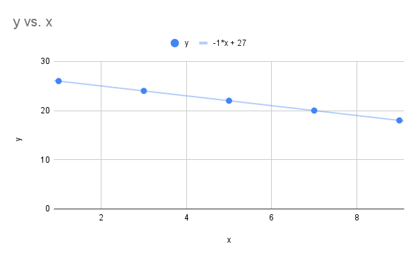
Click to reveal more information
The image is a line graph titled "y vs. x" showing a set of blue data points along with a trend line. The x-axis is labeled "x" and ranges from 0 to 10, while the y-axis is labeled "y" and ranges from 0 to 30. The graph displays five blue circular data points at coordinate positions (1, 26), (3, 24), (5, 22), (7, 20), and (9, 18), indicating a negative trend. The light blue trend line is drawn through all the points and is labeled with the equation y = -1*x + 27. The graph is set on a white background with light gray grid lines.
- Correlation coefficient is
- The equation for the linear regression line is
- The curb weight (in hundreds of pounds) and braking distance (in feet), at 50 miles per hour on dry pavement, were measured for five vehicles, with results shown in the table.
25 27.5 32.5 35 45 105 125 140 140 150 - Find the linear regression line. Round values to four decimal places.
- Interpret the slope in terms of the application.
- If the curb weight is 3000 lbs use the linear regression model to predict the braking distance. Round answer to two decimal places.
- Would it be appropriate to use the linear regression line to predict the braking distance of a vehicle with a curb weight limit of 4000 lbs? What about 6000 lbs?
Answer (click to Show/Hide)
- Start by first constructing the scatter plot (shown below) and finding the correlation coefficient. The correlation coefficient is 0.8835, which shows we do have a linear relationship and it makes sense to find the least squares regression line. The least squares regression line is
Scatter plot breaking distance vs curb weight and linear regression line" Google Sheet for Exercise 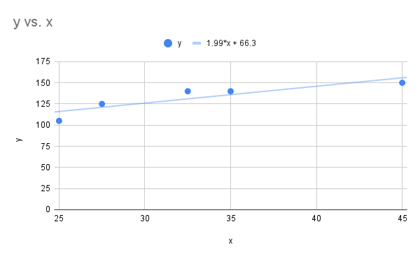
Click to reveal more information
The image is a scatter plot graph displaying data points marked in blue circles, representing a relationship between variables labeled "x" and "y." The horizontal axis is labeled "x" and spans from 25 to 45. The vertical axis is labeled "y" and ranges from 0 to 175. Both axes have grid lines for reference. Five data points are plotted on the graph, showing a trend that increases gradually from left to right. A trend line is drawn through the points, indicated by a thin blue line. Above the graph, the trend line equation is provided: "y = 1.99*x + 66.3."
- The slope was found to be approximately 1.99. This means for each increase of 100 lbs of the curb weight of the vehicle we expect on average the braking distance to increase by 1.99 ft.
- If the curb weight is 3000 lbs, then this corresponds to (and is within the given data set range of 25 to 45). Evaluate the linear regression line to get:
The estimate braking distance is 126.03 ft for a curb weight vehicle of 3000 lbs going 50 miles per hour.
- It is appropriate to estimate the braking distance for a vehicle with a curb weight of 4000 lbs, but not for 6000 lbs. The data range goes from 2500 lbs to 4500 lbs.
- The height at age 2 and at age 20, both in inches, for ten women are tabulated in the table below.
31.3 31.7 32.5 33.5 34.4 35.2 35.8 32.7 33.6 34.8 60.7 61.0 63.1 64.2 65.9 68.2 67.6 62.3 64.9 66.8 - Find the linear regression line. Round values to four decimal places
- Interpret the slope in terms of the application.
- Use the linear regression line (if appropriate) to predict the height of a women at age 20 if the height at age 2 was 25 inches. Round answer to two decimal places.
- Use the linear regression line (if appropriate) to predict the height of a women at age 20 if the height at age 2 was 35 inches. Round answer to two decimal places.
Answer (click to Show/Hide)
- Start by first constructing the scatter plot (shown below) and finding the correlation coefficient. The correlation coefficient is 0.9819, which shows we do have a linear relationship and it makes sense to find the least squares regression line. The least squares regression line is
Scatter plot height at age 20 vs height at age 2 and linear regression line" Google Sheet for Exercise 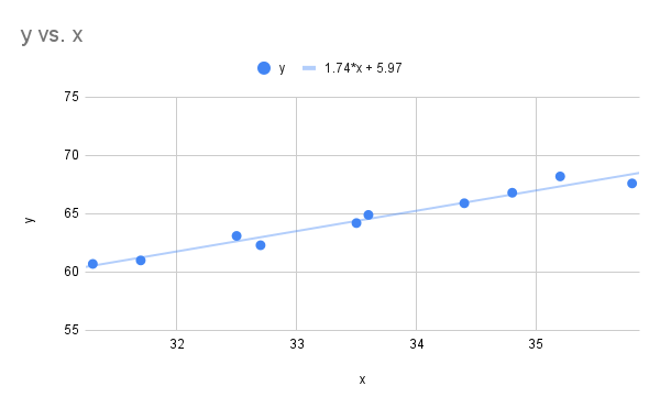
Click to reveal more information
The image is a scatter plot graph displaying a linear relationship between two variables, labeled as "x" and "y." The x-axis ranges from 31 to 36, and the y-axis ranges from 55 to 75. There are ten blue data points scattered across the graph, depicting an upward trend. A blue line of best fit passes through the data points, indicating a positive correlation. The formula for the line is shown as y = 1.74*x + 5.97. The chart title "y vs. x" is located in the top left corner.
- The slope was found to be approximately 1.74. This means for each one inch increase in the height at age 2 we expect on average the height at age 20 to increase by 1.74 inches.
- It may not be appropriate to estimate the height with the linear regression model when the at age 2 they are 25 inches as our data range for age 2 starts at a value greater than 31 inches.
- It is appropriate to estimate the height at age 20 when using an input of 35 inches for the height at age 2 as it falls within the data range of 31.3 to 35.8 inches. Evaluate the linear regression model at :
The model shows for a height of 35 inches at age 2 a women would have a predicated height of 67 inches
- The age and resting heart rate were measured for ten men, with the results show in in the table below.
20 23 30 37 35 45 51 55 60 63 72 71 73 74 74 73 72 79 75 77 - Find the linear regression line. Round values to four decimal places.
- Interpret the slope in terms of the application.
- Use the linear regression line (if appropriate) to predict the heart rate of a 25 year old male. Round answer to two decimal places.
- Use the linear regression line (if appropriate) to predict the heart rate of a 85 years old male. Round answer to two decimal places.
Answer (click to Show/Hide)
- Start by first constructing the scatter plot (shown below) and finding the correlation coefficient. The correlation coefficient is 0.7090, which shows we do have a linear relationship and it makes sense to find the least squares regression line. The least squares regression line is
Scatter plot heart rate vs age and linear regression line" Google Sheet for Exercise 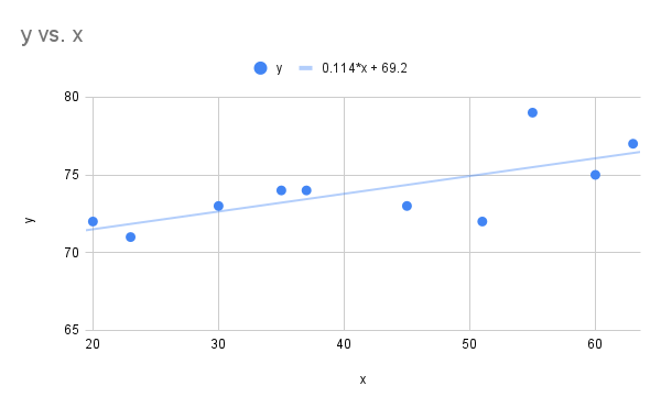
Click to reveal more information
The image is a scatter plot graph displaying data points and a trend line within a coordinate plane. The horizontal axis (x-axis) is labeled from 20 to 60, while the vertical axis (y-axis) is labeled from 65 to 80. Ten blue circular data points are plotted across the graph. A light blue trend line runs diagonally upward from left to right, suggesting a positive correlation between x and y values. Above the graph is a legend showing a blue circle labeled y =0.114*x + 69.2.
- The slope was found to be approximately 0.114. This means for each one year increase in age we expect on average the resting heart rate to increase by 0.114.
- It is appropriate to estimate the resting heart rate when using an input of 25 years old. Evaluate the linear regression model at :
The model shows for at age 25 the resting heart rate should be approximately 72.07.
- It would not be appropriate to use the model for age 85 as the data had age ranges from 20 to 63.
Attributions
This page contains modified content from David Lippman, "Math In Society, 2nd Edition." Licensed under CC BY-SA 4.0.
This page contains modified content from "Beginning Statistics (v. 1.0)." Download for free and license information can by found at: https://2012books.lardbucket.org/. Licensed under CC BY-NC-SA 3.0.
This page contains content by Robert Foth, Math Faculty, Pima Community College, 2021. Licensed under CC BY 4.0.
