4.2 Presenting Quantitative Data Graphically

4.2: Presenting Quantitative Data Graphically
Learning Objectives
Upon completion of this section, you should be able to
- Create and interpret Histograms
- Create and interpret frequency polygons
- Create and interpret basic stem and leaf displays
- Identify common graphical mistakes with graphical representation of quantitative data
Presenting Quantitative Data Graphically
Quantitative, or numerical, data can be expressed as a quantity or a measurement. Height, weight, response time, subjective rating of pain, temperature, and score on an exam are all examples of quantitative data values. Quantitative data is distinguished from categorical (sometimes called qualitative) data such as favorite color, religion, city of birth, and favorite sport in which there is no ordering or measuring involved.
We will start by seeing what happens if we use the same approach to quantitative data as we did with categorical (qualititatve) data. In our first example we will create a frequency table as we did with categorical data in the last section.
Example 1
A teacher records scores on a 20-point quiz for the 30 students in their class. The scores are:
19, 20, 18, 18, 17, 18, 19, 17, 20, 18, 20, 16, 20, 15, 17, 12, 18, 19, 18, 19, 17, 20, 18, 16, 15, 18, 20, 5, 0, 0
These scores could be summarized into a frequency table by grouping like values. Use this frequency table to also construct a bar graph. What are potential issues with this bar graph?
Solution
The score would be our categories for the bars. Count how many of each score and put those in the frequency column.
| Score | Frequency |
|---|---|
| 0 | 2 |
| 5 | 1 |
| 12 | 1 |
| 15 | 2 |
| 16 | 2 |
| 17 | 4 |
| 18 | 8 |
| 19 | 4 |
| 20 | 6 |
It would be possible to create a standard bar chart, like we did for categorical data:
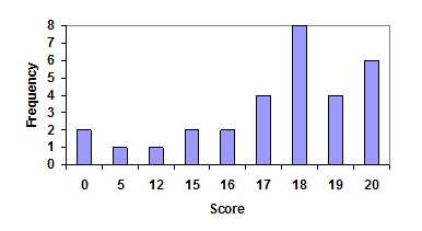
This chart doesn’t really make sense as there is meaning to a difference in two scores; the first and second bars are five values apart, while the later bars are only one value apart. It is not appropriate to creat a bar graph in this case as it hides that gap in scores between values.
Video Explanation of why bar graphs may not be appropriate with quantitative data. (4 mins 54 secs – CC)
For the above example it would be better to treat the horizontal axis as a number line. This way when a bar is added at the appropriate location we can see the gap that exists between values. Not including the gap hides the information from the viewer and is misleading. By adding the structure on the horizontal axis (number line) we are using what is called a histogram.
Histogram
A histogram is like a bar graph, but where the horizontal axis is a number line. Each bar represents a class interval or range of numeric values for the data observations to fall in. Each data value fits into a single class (no overlap).
In general, we define class intervals so that:
- Each interval is equal in width.
- There should be between 5 and 20 classes, typically, depending upon the number of data we’re working with.
For the values in Example 1 above, a histogram would look like:
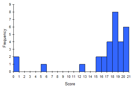
Notice that in the histogram above, a bar represents values on the horizontal axis from that on the left hand-side of the bar up to, but not including, the value on the right hand side of the bar. For example that first bar would represented by all data values in the interval or just the data values of 0 as that is the only whole number within that interval. The last bar would be just the data values of 20 and represents all the data values in the interval: .
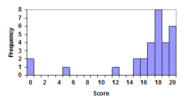
Some people choose to have bars start at ½ values to avoid this ambiguity. The histogram below adjusts the labels so the bars appear over the data value category to avoid confusion. Much of what can be done for the visual appearence can be adjusted for with some work on the users side when using the technology to graph the histogram.
If we have a large number of widely varying data values, creating a frequency table that lists every possible value as a category would lead to an exceptionally long frequency table, and probably would not reveal any patterns. For this reason, it is common with quantitative data to group data into class intervals instead. The information below is to help with the general idea of construction of a histogram if you were to construct them by hand. In this text you will practice with construction by hand to better understand the process and the outputs received by technology.
How to Construct a Histogram
- Construct a frequency table based on the class intervals
- Determine the number of class intervals to be used. Typically a number between 5 and 20 is appropriate, but it can depend on the data and some trial and error may be involved.
- Calculate the class width by taking the range of the data and dividing by the number of class intervals you identified above
At this point you may need to round the class width value. For a general rule of thumb you should round up based on the precision of the data values (if the data has two decimal places, then round up to two decimal places).
- Construct a table with three columns: Lower class limit, upper class limit, and frequency.
Lower Class Limit Upper Class Limit Frequency - Next add Min data value into the first entry for the Lower Class Limit column.
- Fill in the rest of the lower class limits by adding the class width to each previous lower class limit value. Continue to do this until you reach the number of class intervals identified in step 1 or the next lower class limit you would enter is larger than the maximum data value.
- Fill in the Upper Class limits. The upper class limit is the biggest number below the next lower class limit with the same accuracy as the class width.
- Find the frequency for each class interval defined by the lower and upper class limits. If done correctly the total number in the frequency column will add up to the total number of data values.
- Graph the histogram
- First draw the coordinate system ensuring the y-axis starts at 0 and the goes to at least the maximum value in the data set. The x-axis can be truncated to start at the first lower class limit and extends out to at least the last upper class limit value. It is helpful to have just the tick marks representing the lower class limits on the x-axis.
- For each class interval draw a bar going up to the frequency given in the table created. The bar for each class interval starts at the lower class limit and ends at the next lower class limit leaving no gaps between bars unless there is a class interval with a frequency of 0.
- Add labels for the axis and relabel bars if needed (a common approach is to use the midpoint for the class intervals to be used as the label.
When using software the approach may vary from the above. Typically you will need to predefine the lower class limits or upper class limits. The counting can than be done through the software as well as the construction of the graph. The examples below will go through the method as identified above, but the output of the graph from the histogram will be done through Google Sheets or Excel.
Example 2
We will revisit our data from exercise 1 where a teacher records scores on a 20-point quiz for the 30 students in their class. The scores are:
19, 20, 18, 18, 17, 18, 19, 17, 20, 18, 20, 16, 20, 15, 17, 12, 18, 19, 18, 19, 17, 20, 18, 16, 15, 18, 20, 5, 0, 0
Create a histogram for the data using 6, 8, and then 10 class intervals.
Solution
We will go into detail for constructing the frequency table for the 6 class intervals, but only provide short summary for the 8 and 10.
First step is to create the frequency table using 6 class intervals. To get started we find the class width. The Max value in the data is 20 and the Min value is 0. We will round this up to 4 (since all our data are integers). Once we round this value we have a chance of changing the number of intervals needed for the data. If rounded down to 3 we are guaranteed to need more than six intervals.
Next construct the frequency table starting with the Min value of 0 for the first lower class limit:
| Lower Class Limit | Upper Class Limit | Frequency |
|---|---|---|
| 0 | ||
We now fill in the rest of the lower class limits by adding 4 (the class width) to the values.
| Lower Class Limit | Upper Class Limit | Frequency |
|---|---|---|
| 0 | ||
| 4 | ||
| 8 | ||
| 12 | ||
| 16 | ||
| 20 |
Since our data is expressed as an integer we will fill in the upper class limits by using the largest integer below the next lower class limit. The first upper class limit would be 3 since it is the largest value below the next lower class limit found on the second row of lower class limit values. The remaining upper class limit values can be found by adding the class width to the previous upper class limit value.
| Lower Class Limit | Upper Class Limit | Frequency |
|---|---|---|
| 0 | 3 | |
| 4 | 7 | |
| 8 | 11 | |
| 12 | 15 | |
| 16 | 19 | |
| 20 | 23 |
Now the final step for constructing the table is getting the frequency. It may help to keep a tally marker and mark off each data value in a systematic way. Double check you counted all the data by adding up the frequency and see you have the same total as the number of data values you started with.
| Lower Class Limit | Upper Class Limit | Frequency |
|---|---|---|
| 0 | 3 | 2 |
| 4 | 7 | 1 |
| 8 | 11 | 0 |
| 12 | 15 | 3 |
| 16 | 19 | 18 |
| 20 | 23 | 6 |
To construct the Histogram start with labeling the lower class limits on the horizontal axis and going from 0 to 20 on the vertical axis (technically you can go up to 18 as a max). For each class interval you will draw a bar going up to the frequency height. Typically you want the bars to touch each other to show there is no artificial gaps in the data trends, but some programs will put in a very small gap between bars like shown below made from Google Sheets.

Below you will see the tables and histograms for class intervals of size 8 and 10.
| Lower Class Limit | Upper Class Limit | Frequency |
|---|---|---|
| 0 | 2 | 2 |
| 3 | 5 | 1 |
| 6 | 8 | 0 |
| 9 | 11 | 0 |
| 12 | 14 | 1 |
| 15 | 17 | 8 |
| 18 | 20 | 18 |

| Lower Class Limit | Upper Class Limit | Frequency |
|---|---|---|
| 0 | 1 | 2 |
| 2 | 3 | 0 |
| 4 | 5 | 1 |
| 6 | 7 | 0 |
| 8 | 9 | 0 |
| 10 | 11 | 0 |
| 12 | 13 | 1 |
| 14 | 15 | 2 |
| 16 | 17 | 6 |
| 18 | 19 | 12 |
| 20 | 21 | 6 |

It would be better to adjust the graph horizontal axis to remove the 21 to avoid confusion with the context of the application (where 20 was the maximum score), but sometimes the tool we use for the construction has limitations and edits like this may not be possible. It is best to include descriptions with any graphics to help avoid confusion (so in this case adding something about the maximum score being 20 would be helpful).
When we look at the three histograms a slightly different visual display of the data is seen. Does that mean any of them are right or wrong? No. There is no right histogram for a given data set, but there are good ways to go about constructing them. Ensuring the each class interval has an equal width, not distorting the graph through manipulation of the vertial axis, using between 5 and 20 class intervals (typically more class intervals for larger data sets, but trial and error is needed to help determine what number of classes to use).
In many software packages, you can create a graph similar to a histogram by putting the class intervals as the labels on a bar (column) chart, but you need to make sure that you include any bars with 0 frequency and close the gap between the bars. With Google Sheets (at the time of the writing of this text) they removed the ability to close the gaps and add the data labels under each bar.
What should we notice?
After the construction of a histogram there are some questions that should be answered by the researcher when describing the histogram:
- What are the maximum and minimum potential values of the data set?
- How many peaks does the histogram have (a peak can be any bar that has a shorter bar to the left and right or a bar at the left or right hand end that is taller than the adjacent bar)? Where are those locations?
- Are there any gaps in the histogram (places where a bar has a height of 0) and where are they located?
- Does the histogram have a general shape you can describe (uniform, symmetric, skewed left or right, bell-shaped)?
Example 3
We will revisit our data from exercise 1 and 2 where a teacher records scores on a 20-point quiz for the 30 students in their class ignoring we have the original data available to answer some questions.
Answer the following based on the histogram constructored using 8 class intervals (also shown below):
- What are the maximum and minimum potential values of the data set?
- How many peaks does the histogram have (a peak can be any bar that has a shorter bar to the left and right or a bar at the left or right hand end that is taller than the adjacent bar)? Where are those locations?
- Are there any gaps in the histogram (places where a bar has a height of 0) and where are they located?
- Does the histogram have a general shape you can describe (uniform, symmetric, skewed left or right, bell-shaped)?
| Lower Class Limit | Upper Class Limit | Frequency |
|---|---|---|
| 0 | 2 | 2 |
| 3 | 5 | 1 |
| 6 | 8 | 0 |
| 9 | 11 | 0 |
| 12 | 14 | 1 |
| 15 | 17 | 8 |
| 18 | 20 | 18 |
Solution
From the histogram we can see that the first bar starts at 0 and has a frequency of 2. This tells us we have a potential value in the data to be 0 and that would be the smallest or minimum value. The last bar starting at 18 and knowing it ends at 20 lets us know we have a potential maximum value of 20.
There is a peak on the right hand side on the class interval from 18 to 20. The peak reaches a height of 12. Another potential minor peak happens at the lowest class interval of 0 to 2 with a height of 2.
There is a large gap in the middle of the histogram in the class intervals starting at 6 and ending at 11.
The general shape of the histogram can be described as being skewed left as the peak is on the far right and as you move left the data trails off, but another minor peak occurs at the very start with a gap between the two sides.
Now it is your turn to construct a histogram in the Try it Now below.
Try it Now 1
The total cost of textbooks for the term was collected from 36 students. Create a histogram for this data. Use 6 class intervals. Describe the results.
| $140 | $160 | $160 | $165 | $180 | $220 | $235 | $240 | $250 | $260 | $280 | $285 |
| $285 | $285 | $290 | $300 | $300 | $305 | $310 | $310 | $315 | $315 | $320 | $320 |
| $330 | $340 | $345 | $350 | $355 | $360 | $360 | $380 | $395 | $420 | $460 | $460 |
Answer (click to Show/Hide)
With 6 class intervals given to us we start by finding the class width:
The textbook cost is given to us in integers, so we round this up to 54.
Starting with 140 for the first lower class limit we can now construct the frequency table. Add 54 to the first class lower limit and continue to add 54 to the previous lower class limit to fill out the first column.
To get the upper class limit we find the highest number below the next lower class limit, so for the first lower class limit we look at the 2nd row of the lower class limits and see the value is 194, which means the first upper class limit will be 193 (since out data percision is in integers). Add the class width to the upper class limit values to fill down that column. After those are done we count how many data values fall into each interval. The finished table is below and was used to to construct the histogram.
| Lower Class Limit | Upper Class Limit | Frequency |
|---|---|---|
| 140 | 193 | 5 |
| 194 | 247 | 3 |
| 248 | 301 | 9 |
| 302 | 355 | 12 |
| 356 | 409 | 4 |
| 410 | 463 | 3 |

In the histogram and data for textbook prices we see the minimum value is $140 with a maximum value of $460. The histogram shows a peak that occurs between $302 and $356 with a frequency of 12 (out of the 36 data values). There are no gaps shown on this histogram. The overall shape appears to be symmetric about the middle where the peak occurs, but there is a small minor peak on the left hand side between $140 and $194.
Stem-and-Leaf Plots
In some cases when the data set is relatively small it is easier to visualize the entire data set and distribution in a single display. We will look at one way to do that using what is called a stem and leaf plot. In a stem and leaf plot we will be able to see the distribution of the data AND we will be able to show the entire data set. The stem-and-leaf conveys the impressions that a histogram would without going through the process for creating one (it is typically just as easy to create if doing both by hand). The benefit is that a stem and leaf plot also preserves the exact data values.
Stem-and-Leaf Plot
A stem-and-Leaf plot is a visual table that splits the data into a “stem” (first digit(s) of a data value) and a “leaf” (typically the last digit of the data value). The stems are written in a vertical column from smallest to largest. A vertical bar is drawn to the right of the stem. The leaves are then entered to the right of the stem in an increasing order .
Directions:
- Each of the data values will have two parts: left = “stem,” right = “leaf”
- Example for a data value of 45, “4” would be the stem and “5” will be the leaf.
- Align all stems in vertical column in increasing order with a vertical line to their right (remove any duplicate stems and add any stem that appears to be missing in that ordered list – we want to see gaps in the data distribution).
- Place all leaves with same stem on the same row as the stem. Rearrange in an increasing order and keep equal spacing between leaves for all rows so that values align in a column.
- It is important to align the leaves in columns so that we may actually compare the length of each row directly and not worry about data points be clumped together to make two rows appear the same length yet actually have a different amount of data points.
- Label the plot.
Programs like Excel and Google Sheets do not have an automatic way to create a stem-and-leaf plot without typically using a third party solution. Thankfully it is not difficult to style the spreadsheet in either program to look like a stem-and-leaf plot. You can also do this in a Word or Google Doc document as well by using a table and only showing particular borders. In the example below we will go through the process of creating a stem-and-leaf plot using our quiz score data from earlier.
Example 4
A teacher records scores on a 20-point quiz for the 30 students in their class. The scores are:
19, 20, 18, 18, 17, 18, 19, 17, 20, 18, 20, 16, 20, 15, 17, 12, 18, 19, 18, 19, 17, 20, 18, 16, 15, 18, 20, 5, 0, 0
Create a stem-and-leaf plot of the quiz scores.
Solution
We will start by identifying how to break apart the data. Since that data starts at 0 and has a max of 20 and are all intergers it would make sense to break apart the stems as the value in the tens place. This leaves the leaf as the value in the ones place. For instance 17 would create a stem of “1” and a leaf of “7” while the number 5 would give a stem of “0” and a leaf of “5”.
The Stems are 0, 1, and 2. Start by putting those values into a vertical column and add a line to the right of them as shown below:
| Stem | Leaf |
|---|---|
| 0 | |
| 1 | |
| 2 |
Now that we put in the stems it is time to place all the data in the table by adding the leaves in an increasing order. Make sure to repeat values as the length of each stem row is like a histogram bar showing the frequency.
| Stem | Leaf |
|---|---|
| 0 | 0 0 5 |
| 1 | 2 5 5 6 6 7 7 7 7 8 8 8 8 8 8 8 8 9 9 9 |
| 2 | 0 0 0 0 0 0 |
In the next example pay attention to what we do for a missing stem. The missing stem helps show what is happening in the data by identifying the gap that exists between values.
Example 5
The following is a list of student ages in a MAT 142 course from Fall of 2020 at the start of the semester: 17 18 18 18 18 18 18 18 18 18 18 19 19 19 19 19 20 20 20 22 28 31 55
Create a stem-and-leaf plot of the ages.
Solution
We can naturaly break up each age into a stem and leaf by using the tens place for the stem and the ones place as the leaf. Start with creating a colum for stems. Notice how we include the missing “4” stem between 3 and 5.
| Stem | Leaf |
|---|---|
| 1 | |
| 2 | |
| 3 | |
| 4 | |
| 5 |
Next add in the leaves behind each stem. Again make sure the leaves align in columns of equal spacing.
| Stem | Leaf |
|---|---|
| 1 | 7 8 8 8 8 8 8 8 8 8 8 9 9 9 9 9 |
| 2 | 0 0 0 2 8 |
| 3 | 1 |
| 4 | |
| 5 | 5 |
Try it Now 2
The following is some data from past Oscar-winning Best Actors (males).
| 32 37 36 32 51 53 33 61 35 45 76 37 42 40 32 60 38 56 48 48 62 43 42 44 41 56 39 46 31 47 46 40 36 39 43 60 55 40 45 |
Create a stem-and-leaf plot for the data. Is there anything we should be concerned about after the creation?
Answer (click to Show/Hide)
Each value is a two digit number (if someone were to be age 8 we would write 8 as 08 to put it into the same form). The first digit is the “stem” and second digit of each number is a “leaf”. We create the plot by listing all possible values of “stems” in a vertical column starting with the lowest and ending at the highest value (if there is a gap we put the value of the missing stem in the place, but will have no leafs attached to it on the right hand side). Each “leaf” is then placed to the right of its stem in an increasing order (best to start by lookinng for any leafs with a value of 0 and add it to the right for each zero then continue on to the ones, twos, etc…. When done you have a visualization that shows you all the data values along with their distribution (more powerful then just looking at the raw data by itself).
| Stem | Leaf |
|---|---|
| 3 | 1 2 2 2 3 5 6 6 7 7 8 9 9 |
| 4 | 0 0 0 1 2 2 3 3 4 5 5 6 6 7 8 8 |
| 5 | 1 3 5 6 6 |
| 6 | 0 0 1 2 |
| 7 | 6 |
The plot allows us to see a visual distribution of the ages – from here we can try to make sense of the age of male oscar winners. For instance we can say it appears you have a better chance of winning if you are in your 30’s or 40’s. The thing to watch out for in this type of graph (and histograms in general) is that you lose track of a possible variation in results over time (we do not know if the trend of the ages was changing over time or if this distribution is held constant over time).
Identify common graphical mistakes
In the instructions for histogram and stem-and-leaf plot construction you were given details to help avoid distorting the data visually. We will look at some examples where an error was made in a graph for quantitative data and discuss the importance of being able to identify the error and what to watch out for when creating your own graphical display for data. Much of what we learn in the examples can be extended to graphs that we did not introduce in this section (a few examples below are also of graphs we did not review on how to make, but follow similar structures to our work from above).
Example 6
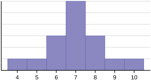
In the histogram below we have the wait times (to the nearest tenth a minute) recorded at a local fast food drive thru on a randomly selected day. The general manager is making a presentation to the regional manager about these wait times. Identify any cause for concern for how the data was presented in the histogram.

Click to reveal more information
The image is a histogram titled “Wait Times Drive Thru.” It displays the frequency of drive-thru wait times on the x-axis and the frequency on the y-axis. The x-axis is labeled “Wait times,” ranging from 0.00 to 5.00 in increments of 1.00. The y-axis is labeled “Frequency,” ranging from 3 to 12. There are five blue bars, each representing a range of wait times. The first bar, from 0.00 to 1.00, has a height reaching approximately 8 in frequency. The second bar, from 1.00 to 2.00, is the tallest at around 11. The third bar, from 2.00 to 3.00, has a frequency of about 9. The fourth bar, from 3.00 to 4.00, has a frequency of about 7. The last bar, from 4.00 to 5.00, is the shortest, with a frequency of approximately 4.
Solution
The first concern we can identify is that the vertical axis begins at 3 instead of zero. Visually it would appear the wait times for 3 to 4 minutes is about half the wait times from 1 to 2 minutes, but that is not what the actual data shows. The wait times really about two thirds instead of half if you extend the vertical axis down to 0.
A minor point of concern is not having any grid lines and tick marks for the vertical axis for the height of each bar. Without some visual aid it can be challenging to read the direct height from the vertical axis on each bar. Without the tick marks it is also challenging to know which value goes to a bar height.
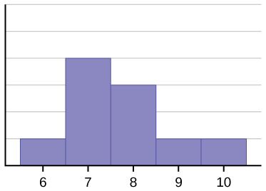
Below is the adjusted histogram.

Click to reveal more information
The image is a histogram titled “Wait Times Drive Thru (Fixed)” displayed in a simple style. The chart has horizontal and vertical axes. The horizontal axis represents “Wait Times” and ranges from 0.00 to 5.00. The vertical axis, labeled “Frequency,” extends from 0 to 12. The chart includes five vertical bars, each representing a different segment of wait times. The first bar, denoted for wait times between 0.00 and 1.00, reaches up to a frequency of 8. The second bar, representing 1.00 to 2.00 wait times, peaks at a frequency of 11. The third segment, 2.00 to 3.00, shows a frequency of 9. The fourth bar, for 3.00 to 4.00 wait times, has a frequency of 7. The final bar, between 4.00 and 5.00, rests at a frequency of 4. All bars are distinctly blue and evenly spaced.
Looking at the fixed histogram it shows how the shorter wait times were not as high as previously seen when compared to the longer wait times. In this example we set up the scenario in a more nefarious way, but typically you may see those truncated graphs appear unintentionally. The problem though is that it can change the perception or feeling on a topic if shown that way. This is not isolated just to histograms as that change in the vertical axis can happen with other types of charts or graphs used to display data.
In the next example we will look at a chart that is similar to histograms, but instead uses a frequency polygon. A frequency polygon starts out like a histogram, but instead of drawing a bar, a point is placed in the midpoint of each interval at height equal to the frequency. Typically the points are connected with straight lines to emphasize the distribution of the data. When the horizontal axis represents time it is typically called a Time Series graph.
Example 7
In the graph below the unemployment rate is shown for four quarters from Dec 7 till June 10. Examine the graph and identify any concerns about how it was constructed.
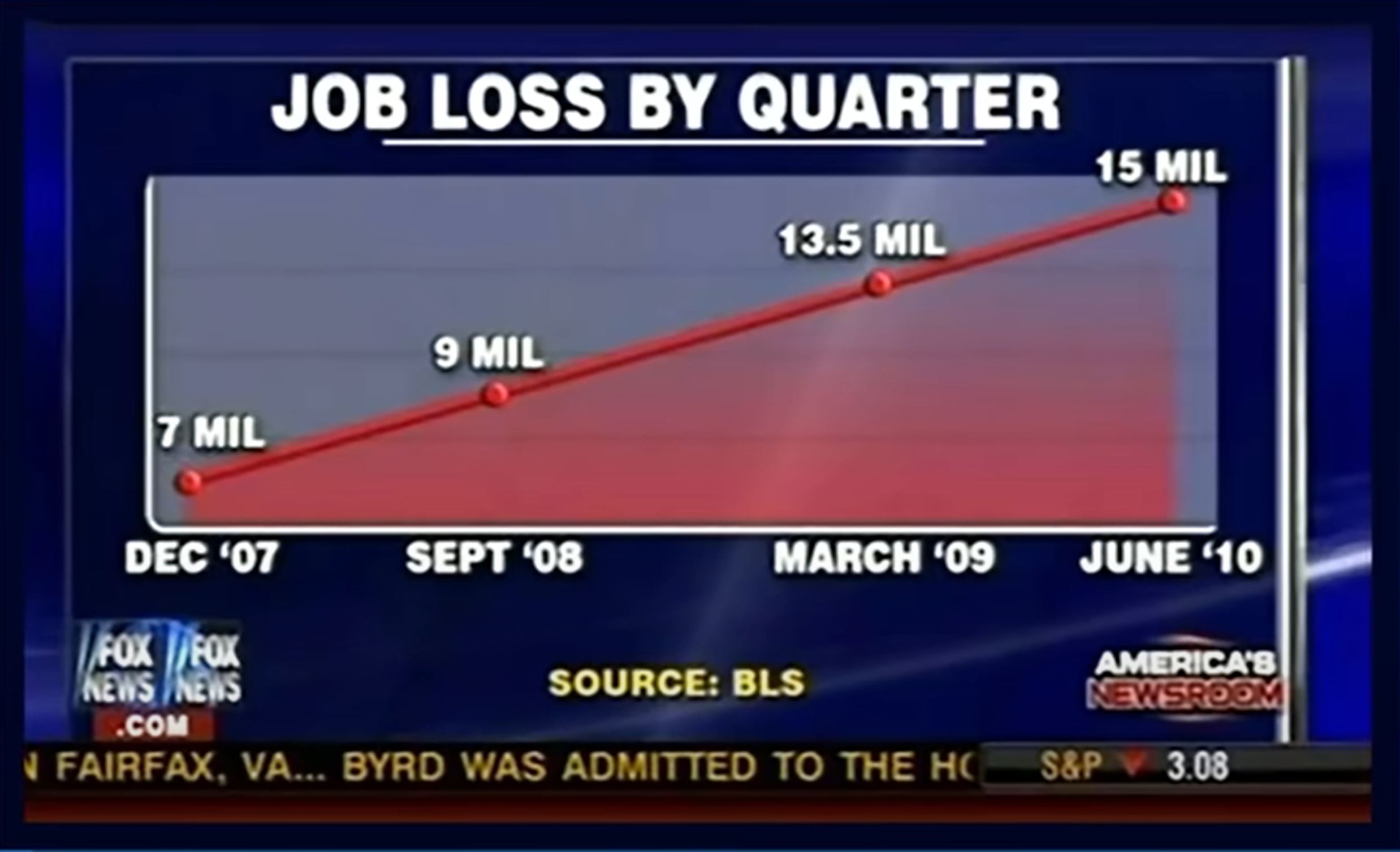
Solution
The title is the first misleading piece of information on this chart. The data presented does not represent the (gross) job loss for the given quarter, but rather the total unemployed at that time.
The horizontal axis is missing quarters between the start of Dec 07 and June 2010. This is an example of cherry picking data as only those selected quarters were used. If they used all the quarters would the chart give a different interpretation? Possibly.
Related to the above is that the horizontal axis uses different time spans between the data points. When looking at the last two dates listed of March 09 and June 10 we can count 15 months between them, but the corresponding pair right before is a shorter span with a longer gap having 9 months.
The vertical axis does not start at 0. This visually distorts the difference in values and makes the doubling of unemployment between Dec 07 and June 10 seem larger.
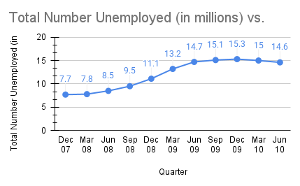
Take a look below at the adjusted chart including all the quarters starting at Dec 7 and extending through June 2010. The table of data is also provided for reference.
| Quarter | Unemployed (in Millions) |
|---|---|
| Dec 07 | 7.7 |
| Mar 08 | 7.8 |
| Jun 08 | 8.5 |
| Sep 08 | 9.5 |
| Dec 08 | 11.1 |
| Mar 09 | 13.2 |
| Jun 09 | 14.7 |
| Sep 09 | 15.1 |
| Dec 09 | 15.3 |
| Mar 10 | 15 |
| Jun 10 | 14.6 |
Click to reveal more information
The image is a time series (also called a line graph) depicting the total number of unemployed individuals (in millions) over several quarters from December 2007 to June 2010. The x-axis represents time in quarterly increments, from December 2007 (Dec 07) to June 2010 (Jun 10). The y-axis shows the total number of unemployed in millions, ranging from 0 to 20. The graph shows a general upward trend in unemployment over the given period. It begins at 7.7 million in December 2007, gradually increases to a peak of 15.3 million in September 2009, and slightly decreases to 14.6 million by June 2010. The data points are marked with blue dots and connected by a blue line.
What should we watch out for in a graph?
- Look at the vertical axis. Does it start with 0? If not why is that?
- Does it look like the data was cherry picked (look for non-uniform horizontal values in a time series, or missing values in the time series where data points should be)?
- Does the vertical and horizontal axis keep a consistent scale (does not jump values)?
- Were graphics used to display a bar? If so did the volume or area stay relative to data values?
- For histograms did it add large gaps between bars that should be connected?
- For histograms did it use consistent class widths?
- Does the title match up with the data?
- On a stem-and-leaf plot is it missing any stems (gaps in stem values)?
Exercises
- A student collected data about the type of cola students liked to drink. In the process he had people select out of four different brands (Pepsi, Coke, Sprite, Diet Cola). Would it be appropriate to graph the frequency with a historgram? Why or why not.
Answer (click to Show/Hide)
It would not be appropriate as the selection of brand is a categorical data value and histograms are used only for a quantitative data value. It would be more appropriate to use a bar graph or pie chart.
- What is the difference between a bar graph and a histogram?
Answer (click to Show/Hide)
The main difference starts at what type of data you are analyzing. A bar graph is used for categorical data and each category represents a graph with a height of how many observations we have. The bar graph bars also do not touch each other and can be rearranged in any order. A histogram can be used to analyze quantitative data and have bars represented by class intervals that do touch as no gap should exist between two class intervals that data would fall into.
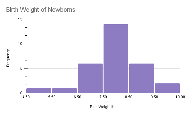
- The weights of newborn babies are given on the histogram below. If the the newborn weighs between 6.5 lb and 8.5 lb they are considered healthy. If the baby weights below 5.5 lbs we classify the baby as a low birthweight (some low birthweight babies are healthy, but others can have health problems that could be serious).
- What percentage of these newborns were healthy?
- What percentage of these newborns are considered to have a low birthweight?
Click to reveal more information
The image is a histogram titled “Birth Weight of Newborns.” It displays data on the frequency of newborns’ birth weights measured in pounds (lbs), ranging from 4.5 to 10 lbs. The x-axis represents birth weight in pounds with increments of 0.5 lbs, while the y-axis shows frequency, ranging from 0 to 15. Six vertical bars are depicted, each in a shade of purple. The bar corresponding to the 7.5 to 8 lbs interval is the tallest, reaching a frequency of 14. The bars for the intervals of 6.5 to 7 lbs and 8.5 to 9 lbs each have a frequency of 6. The remaining bars, representing other weight ranges, have lower frequencies. Gridlines are evident in the background for visual reference.
Exercise 3: Newborn baby weights.Google Sheet for Exercise 3 Answer (click to Show/Hide)
- Looking at the histogram we see the number of newborns between 6.5 lb and 8.5 lbs is found in the two class intervals defined by 6.5 to 7.5 and 7.5 to 8.5. There are a total of 20 newborns in those intervals.
The total number of newborns on the histogram is: .
This gives us the percentage of newborns in the healthy weights as: .
We have approximately 66.7% newborns in the healthy weight.
- The first class interval from 4.5 to 5.5 has one newborn within, so the percentage of newborn that are considered low birthweight is:
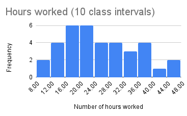
- The table below shows the number of hours worked for the 36 employees at a local restaurant.
- Construct a histogram using 10 class intervals and another histogram with 20 class intervals.
- If you were to increase the number of class intervals to 25 what would you expect to happen with the histogram?
- The affordable care act defines a full time employee as one working 30 or more hours per week. What percent of the work force would be considered a full time employee?
38 20 28 12 44 11 22 29 18 34 30 25 08 24 18 13 25 43 38 36 47 20 32 18 15 20 22 35 18 21 18 30 36 24 16 13 Answer (click to Show/Hide)
- The two histograms are below:
Click to reveal more information
The image depicts a histogram titled “Hours worked (10 class intervals).” The chart has a horizontal x-axis labeled “Number of hours worked,” ranging from 8.00 to 48.00. The vertical y-axis is labeled “Frequency” with values from 0 to 6. There are nine bars representing different intervals of hours worked. The tallest two bars, reaching a frequency of 6, are located at the intervals 16.00 to 20.00 and 20.00 to 24.00. Other intervals vary with frequencies between 1 and 4. The bars are uniformly blue, and the chart is set against a white background with light gray grid lines for reference.
Hours worked with 10 class intervals. Google Sheet for Exercise 4 Click to reveal more information
The image is a histogram titled “Hours worked (20 class intervals)” displaying the frequency of hours worked. The x-axis represents the number of hours worked, divided into intervals of four hours, ranging from 8.00 to 48.00 hours. The y-axis indicates the frequency from 0 to 6. Bars are colored blue, with varying heights. Notably, the tallest bar, indicating a frequency of 5, corresponds to the 20.00-hour interval. The intervals between 24.00 and 40.00 hours have relatively consistent frequencies between 1 to 3. Smaller bars appear at the higher and lower ends of the intervals.
Hours worked with 20 class intervals. Google Sheet for Exercise 4 - If we were to create another histogram from the same data, but instead use 25 class intervals we would expect the shape to further flatten out to many bars with very low frequency. As we increase the number of class intervals it looks like we may also get more intervals with 0 data values inside (0 for the frequency).
- The histogram with 10 class intervals has 30 in the 28-32 interval. We will not be able to use that histogram to figure out how many workers worked 30 hours or more. We can however use the second histogram with 20 class intervals and count the frequency of the bars starting with the 30-32 and going to the end. There are a total of workers. Having a total of 36 workers we can find the percentage as: . There are roughly 33.33% workers who would be considered full time.
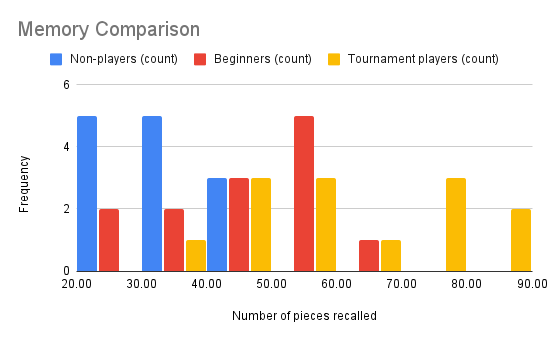
- (Side by Side Histograms) An experiment compared the ability of three groups of participants to remember briefly-presented chess positions. The data are shown below. The numbers represent the total number of pieces correctly remembered from three chess positions after the first ten moves. Create a histogram for each of the player types using the same class intervals (start the first class interval as 20 – 29) for these three groups. What can you say about the differences between these groups from the Histograms?
Non-players Beginners Tournament players 21 29 39 22 32 40 22 37 42 26 29 49 30 40 53 30 41 57 32 45 58 34 51 63 39 52 71 40 56 79 43 56 79 43 58 88 44 60 89 Answer (click to Show/Hide)
To construct a side by side histogram we follow the general procedure for constructing a histogram, but instead of just one bar in a class interval there will be three spaces for bars (all equal width and in a consistent order) where each bar is raised to the height of the data for the bars. When constructing you will keep the same order of the bars for each class interval. Any bar with 0 frequency will still be on the chart, but would be represented with empty space. Below you can see the side by side histogram for the three groups (non-players, beginners, and tournament players). On the chart we can see that the non-player are less likely to remember the chess pieces when compared to the other two groups. There are two bars in the class intervals of 20 to 29 and 30 to 39 where the bars are the highest. The beginners do a little better then the non-players with a peak that occurs in the class interval of 50 to 59. The tournament players memory is more spread out, but overall higher then the beginner group. The tournament group appears to have two different location for peaks (two class intervals 40 to 49 and 50 to 59 form one peak while other peak is in the interval 7There is overlap between all three groups in the class interval 70 to 79.
Click to reveal more information
The image is a side by side histogram chart titled “Memory Comparison,” displaying data for three categories: Non-players, Beginners, and Tournament players. Each category is represented by a different colored bar within six class intervals ranging from 20 to 89 for the “Number of pieces recalled.” The y-axis represents the frequency, which ranges from 0 to 6.
- In the 20-29 interval, Non-players have a frequency of 5 (blue), Beginners 2 (red), and Tournament players 0 (yellow).
- In the 30-39 interval, Non-players again have a frequency of 5 (blue), Beginners 2 (red), and Tournament players 1 (yellow).
- In the 40-49 interval, all groups have a frequency of 3.
- In the 50-59 interval, Beginners have a frequency of 5 (red), with Non-players having 0 (blue) and Tournament players 3 (yellow).
- In the 60-69 interval, Non-players have 0 (blue), Beginners have 1 (red), and Tournament players 1 (yellow).
- In the 70-79 interval, only Tournament players have a frequency of 3 (yellow).
- In the 80-89 interval, Tournament players have a frequency of 2 (yellow).
Side by side histogram for memory test: Google Sheet for Exercise 5 - Eight hundred adult Americans were asked by telephone poll, “What do you think constitutes a middle-class income?” The results are summarized in the table below.
Middle-Class Income Survey Results Income Range Number of Respondents $20,001 – $40,000 13 $40,001 – $60,000 79 $60,001 – $80,000 169 $80,001 – $100,000 148 $100,001 – $120,000 122 $120,001 – $140,000 115 $140,001 – $160,000 84 $160,001 – $180,000 40 $180,001 – $200,000 11 $200,000 + 3 Answer the following questions:
- How many people in the survey did not answer the question (was not sure)?
- In 2019 the Tucson Unified Governing Board approved the starting salary of teachers to be $40,200. Based on the survey approximately what percent believe people making $40,000 or more has a middle-class income?
- Would it be appropriate to apply the results of the survey to teachers salary in TUSD?
- Can we construct a histogram based on the given table?
- Construct a bar graph based on the table.
- In 2019 the Tucson Unified Governing Board approved the starting salary of teachers to be $40,200. Based on the survey approximately what percent believe people making $40,000 or more has a middle-class income?
- The height in feet of 25 trees is shown below (lowest to highest). Construct a stem and leaf plot and describe the distribution of tree heights.25, 27, 33, 34, 34, 34, 35, 37, 37, 38, 39, 39, 39, 40, 41, 45, 46, 47, 49, 50, 50, 53, 53, 54, 54
Answer (click to Show/Hide)
In the stem and leaf plot we can see we have a peak on the 3 stem which means we have more tree with heights in the 30 ft to 39 ft range. Very few trees were observed below 30 ft (only 2 in the 20 ft to 29 ft range)
Tree Heights Stem Leaf 2 5 7 3 3 4 4 4 5 7 7 8 9 9 9 4 0 1 5 6 7 9 5 0 0 3 3 4 4 - The weights of newborn babies are listed below. Can you construct a stem and leaf plot to show the distribution of weights? If so, then construct the plot.6.4, 8.6, 8.9, 8.1, 4.8, 8.4, 6.6, 7.8, 8.0, 6.5, 5.8, 6.9, 7.9, 7.6, 7.7, 6.7, 6.5, 6.0, 7.5, 7.7, 8.4, 7.3, 7.7, 7.0, 6.8, 8.1, 8, 10.1, 7.7, 8.2, 7.2, 7.6, 8.2, 6.4, 7.9, 6.2, 5.7, 6.4, 7.1, 5.1
Answer (click to Show/Hide)
It would be appropriate as each weight value can be broken into two parts and we have more then one stem to show a distribution of the data. Break the data into two parts by taking the stem as the digits before the decimal point on each number and the leaf would be the value in the tenth place. For example the weight 7.2 would be broken into a stem of “7” and a leaf of “2”.
Newborn Weigts Stem Leaf 3 4 8 5 1 7 8 6 0 2 4 4 4 5 5 6 7 8 9 7 0 1 2 3 5 6 6 7 7 7 7 8 9 9 8 0 0 1 1 2 2 4 4 6 9 9 10 1 - The historgram shown below is misleading. Explain why.
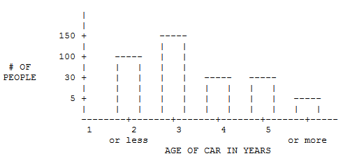
Answer (click to Show/Hide)
In the histogram the vertical axis scale is inconsistent as the gap between tick marks are equal in visual distance, but the values change dramatically between them. The first gap has a length of 5, the second gap has a width of 25, the third gap has length of 70, and the fourth gap has width of 50. This means when looking at the brs the “or more” category may only look like half the height of either the 4 or 5 bar, but in actual values it is one fifth the amount (not the half we see visually). Same goes for comparision between all other bars for the histogram.
- An advertisement for Acme Investments displays the two graphs (below) to show the value of Acme’s product in comparison with the Other Guy’s product. Describe the potentially misleading visual effect of these comparison graphs. How can this be corrected?
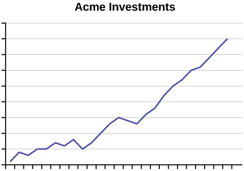
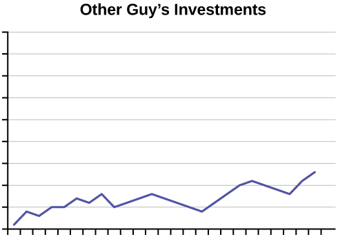
Answer (click to Show/Hide)
The values on both the horizontal and vertical axis are missing. Without knowing the scale on each graph it is not possible to know if Acme truly had a higher value for the investment.
Attributions
This page contains modified content from David Lippman, “Math In Society, 2nd Edition.” Licensed under CC BY-SA 4.0.
This page contains modified content from “Collecting Data” by Foster et al., LibreTexts is licensed under CC BY-NC-SA 4.0.
This page contains modified content from “OpenStax Introductory Statistics” by Barbara Illowsky, Susan Dean. Licensed under CC BY 4.0.
This page contains content by Robert Foth, Math Faculty, Pima Community College, 2021. Licensed under CC BY 4.0.
